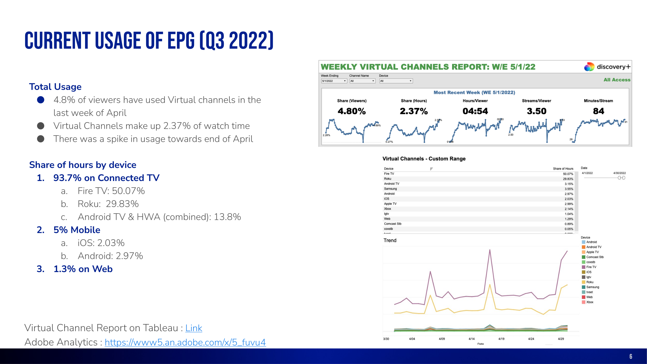
The dominant device category, making living-room interaction the primary design constraint.
Discovery Networks · Streaming product leadership
Turning live TV discovery into a measurable product experience.
I led the UX direction for discovery+'s electronic programme guide, connecting research, cross-platform architecture, connected TV interaction design and post-launch measurement.
The challenge
One scalable TV guide across markets and devices.
Discovery Networks offered live and simulcast programming through different brands, affiliates and platform implementations across Europe. The move towards a more consistent discovery+ service created a need for a unified electronic programme guide.
The guide had to work across connected TV, web and mobile, meet current usability and accessibility expectations, and fit a platform landscape that included hosted web apps and native experiences.
A smaller but important context requiring touch-friendly browsing and clear responsive behaviour.
A low-volume context that still needed consistency with the shared product model.
Device share recorded in the project usage baseline for Q3 2022.
Design leadership
Creating clarity, pace and shared ownership.
I led an intensive two-week discovery and definition sprint within a broader MVP programme. I coordinated three senior UX designers and worked directly with product design, research, product management and engineering.
My role combined direction with hands-on delivery: framing the work, aligning the team around evidence, shaping the information architecture, producing responsive and connected TV concepts, and defining acceptance and measurement criteria.
Framed the MVP
Balanced business objectives, technical constraints and user needs through the PRFAQ and Lean UX canvas.
Mobilised specialists
Set priorities across UX, product design and research while coordinating work by platform.
Made decisions visible
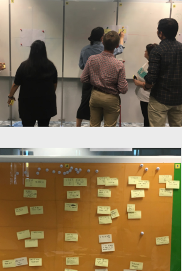
Used workshops, flows, prototypes and shared documentation to build cross-functional agreement.
Connected craft to evidence
Reviewed interaction details against research, platform guidance, accessibility and the design system.
Evidence and priorities
Usage data and usability research set the direction.
The team combined analytics, customer feedback, usability findings, competitive analysis and connected TV platform guidance. This made prioritisation practical rather than opinion-led.
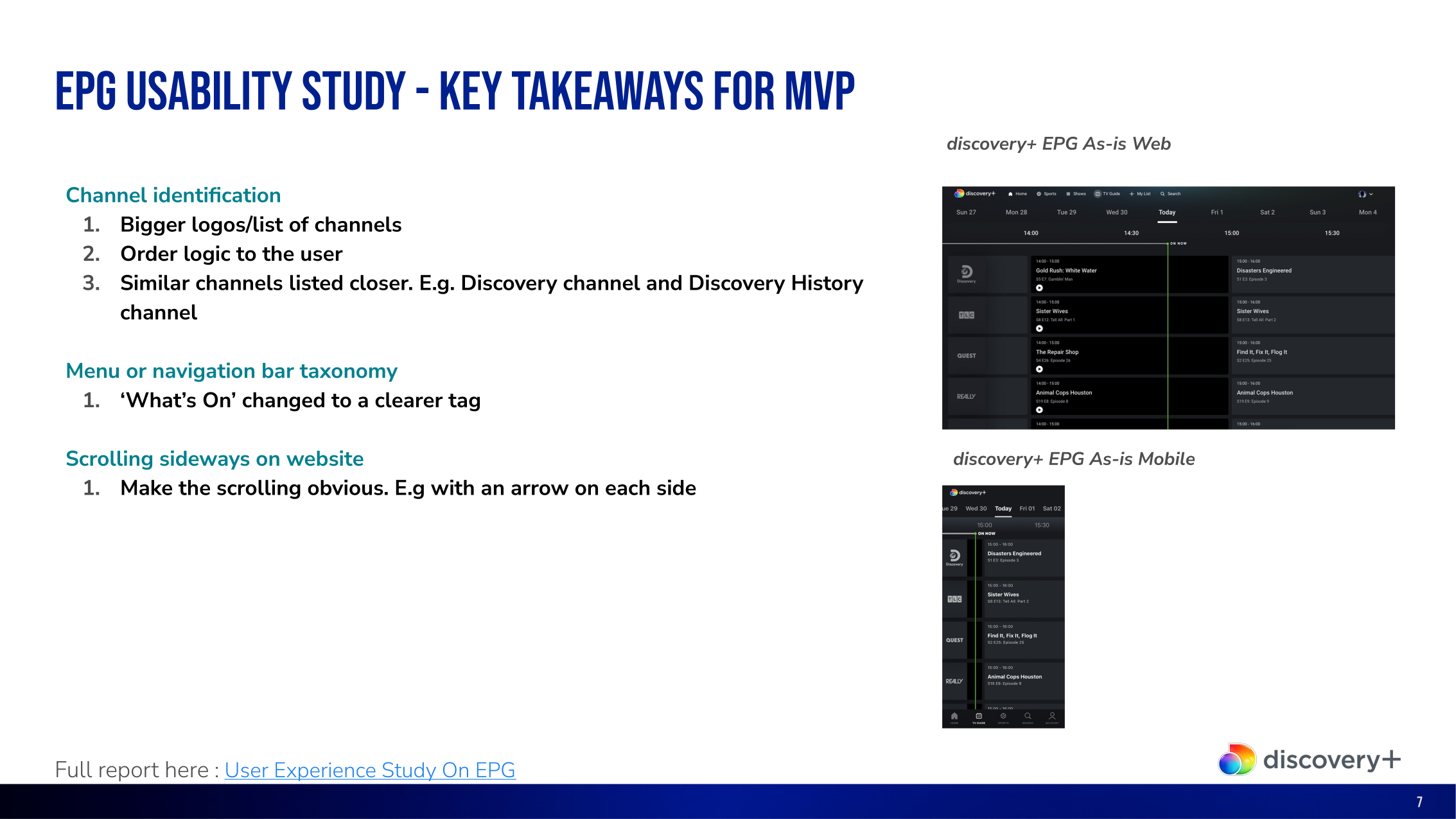
Research highlighted clear opportunities: make channel identity more prominent, introduce understandable ordering, group related channels, clarify navigation labels and make horizontal browsing more obvious.
Lean delivery model
A rapid sprint inside a broader iterative programme.
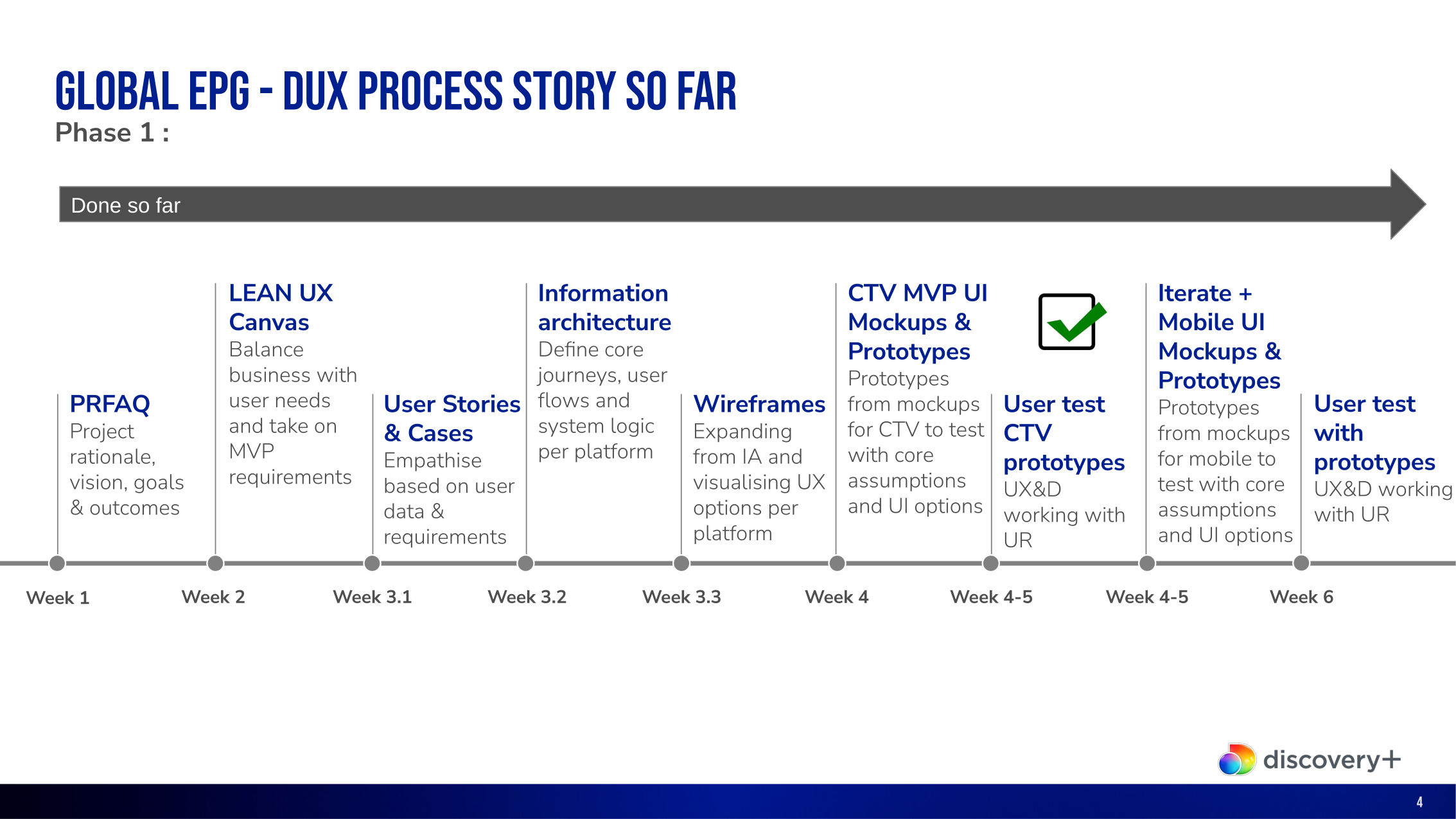
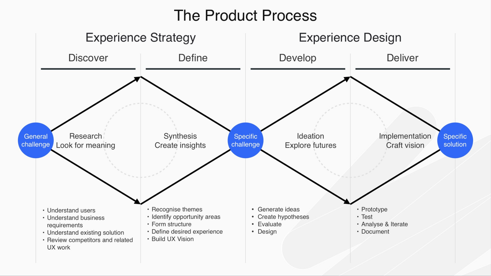
The initial sprint established the shared problem, requirements and design direction. The wider programme then moved through cross-platform modelling, prototyping, user testing, detailed specifications, UAT and post-launch measurement.
This structure protected speed without reducing the work to visual production. Each phase created evidence or decisions that the next phase could use.
Align
PRFAQ, business goals, Lean UX canvas and MVP boundaries.
Model
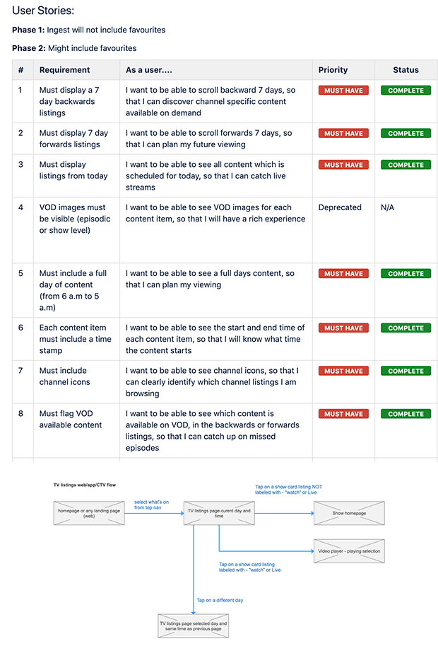
User stories, information architecture, system logic and core journeys.
Prototype
Wireframes and interactive options for connected TV, mobile and web.
Validate
User testing, iteration, acceptance criteria and implementation support.
Measure
UAT, H.E.A.R.T. metrics and continuous improvement after launch.
The work behind the interface
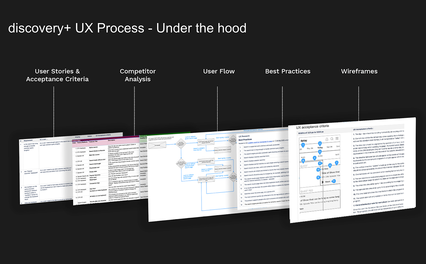
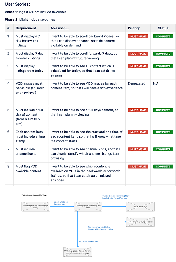
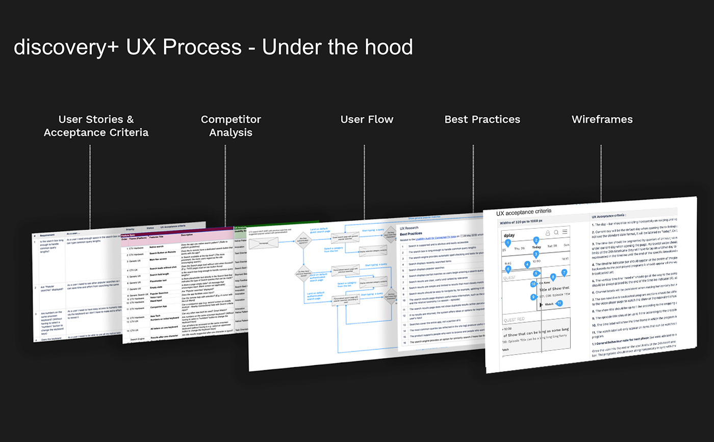
The team moved from requirements and acceptance criteria through competitor analysis, user flows and platform guidance before committing to wireframes.
Phased delivery and iteration
The wider delivery model connected the initial sprint to prototyping, testing, specification, UAT and post-launch optimisation.
Product design progression
Turning the programme model into clear interaction patterns.
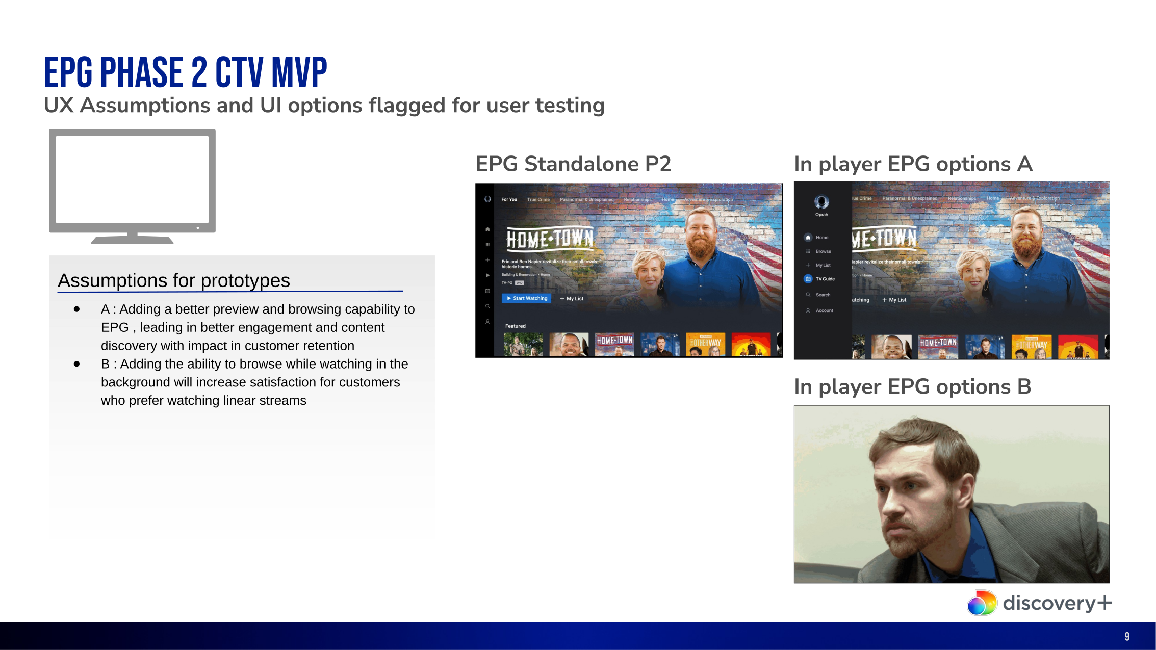
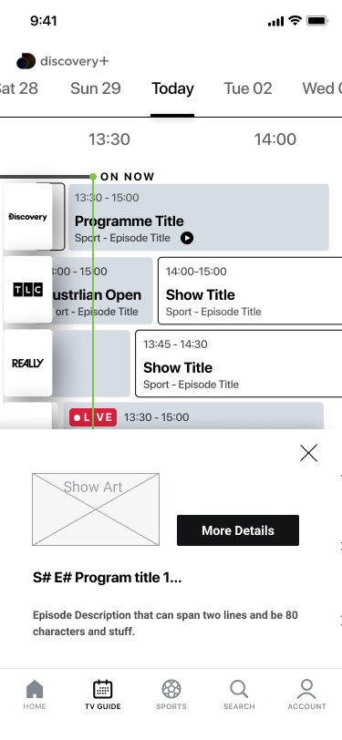
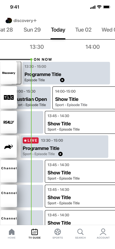
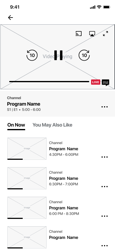
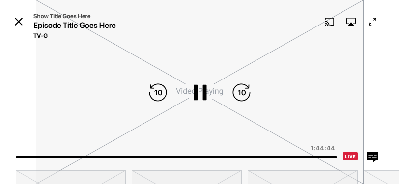
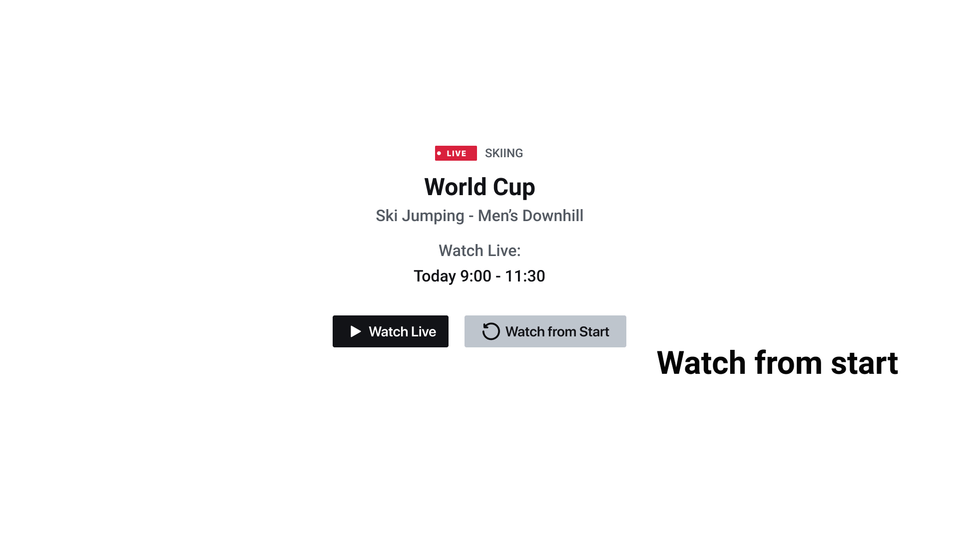
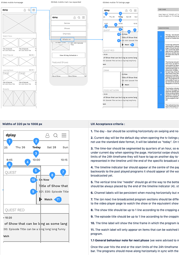
The wireframes resolved how viewers moved between dates, channels and programme details, then into live playback. They also defined progressive disclosure, focus behaviour, watch-live and watch-from-start actions, and the relationship between schedule and player.
The same product logic was translated across touch and remote-control interfaces before visual design was applied.
Mobile schedule and player wireframes
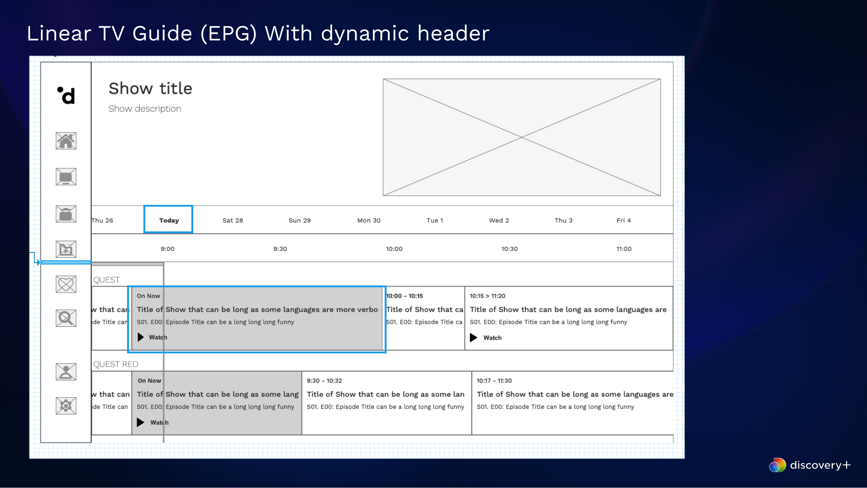
Detailed mobile flows tested browsing density, programme detail, live states and the hand-off from schedule to viewing.
Usability testing and iteration
Testing confirmed the core interaction model.
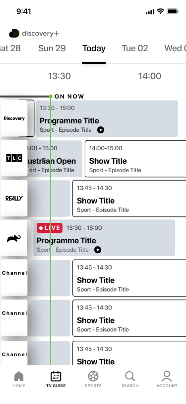
Prototype testing examined the controls that helped viewers narrow a large sports catalogue. Participants engaged with the subscription-tier toggle, quickly recognised competition logos as filters and understood that selecting a date opened the calendar filter.
The findings gave the team confidence in the navigation model and provided specific evidence for the next design iteration.

Final product design
A visual EPG that scales from living-room screens to mobile.
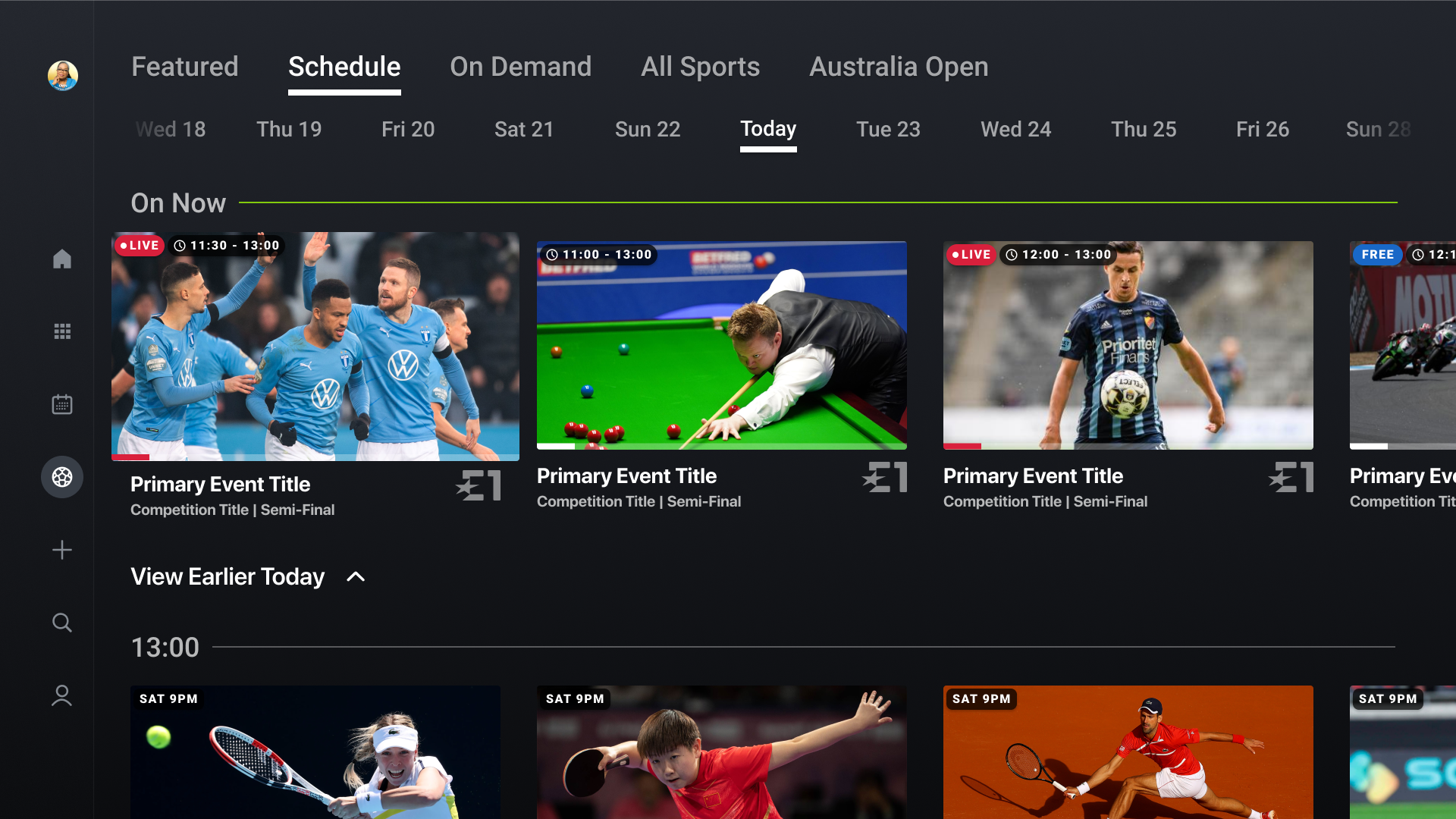
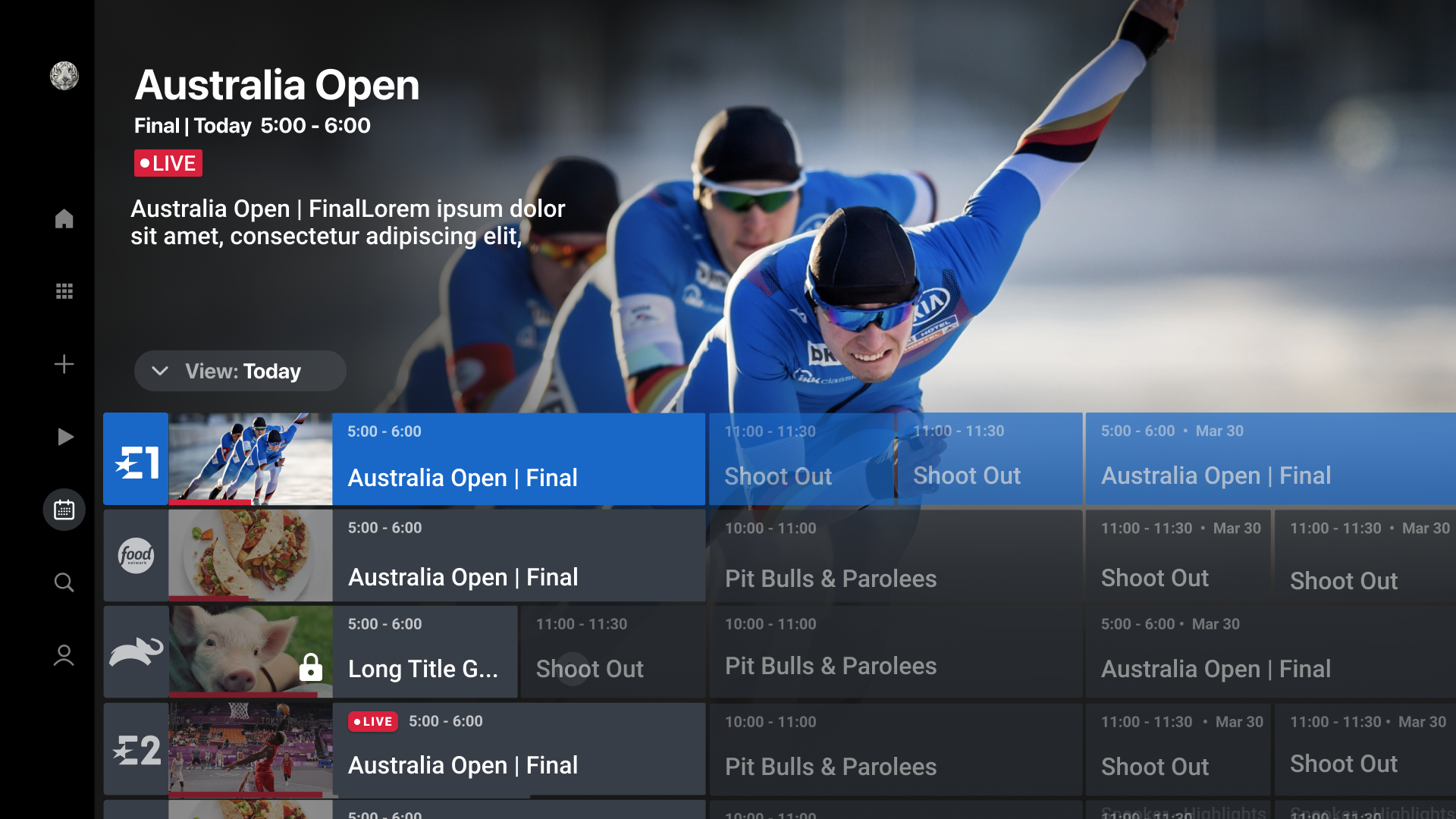
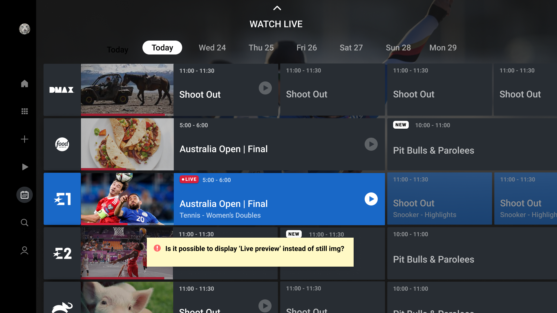
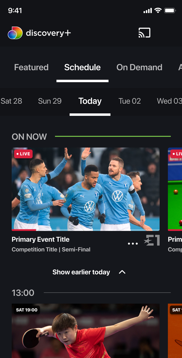
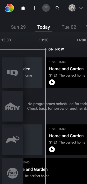
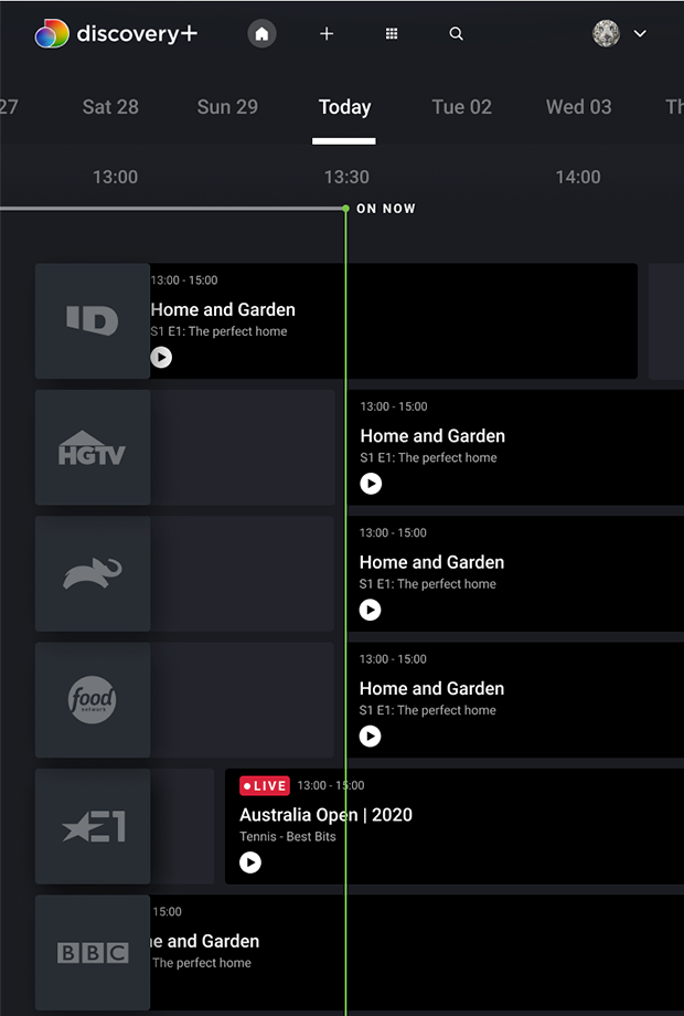
The final interface brought strong programme imagery and live status into the schedule while preserving the scanning speed of a conventional guide. On connected TV, the design used legible typography, clear focus states and remote-friendly interaction.
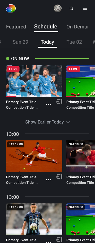
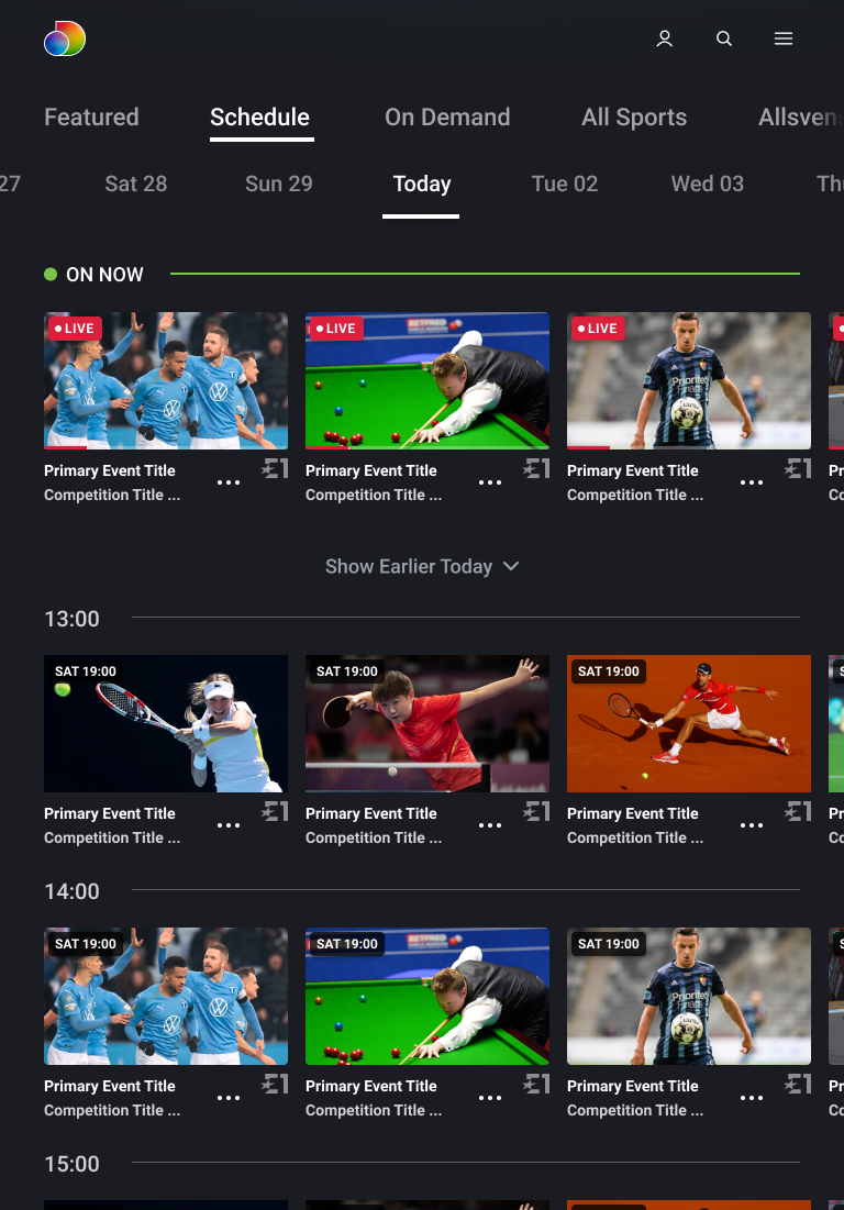
The responsive system retained the same hierarchy across desktop, tablet and mobile, then connected schedule decisions to live viewing and watch-from-start states.
Schedule and sports discovery
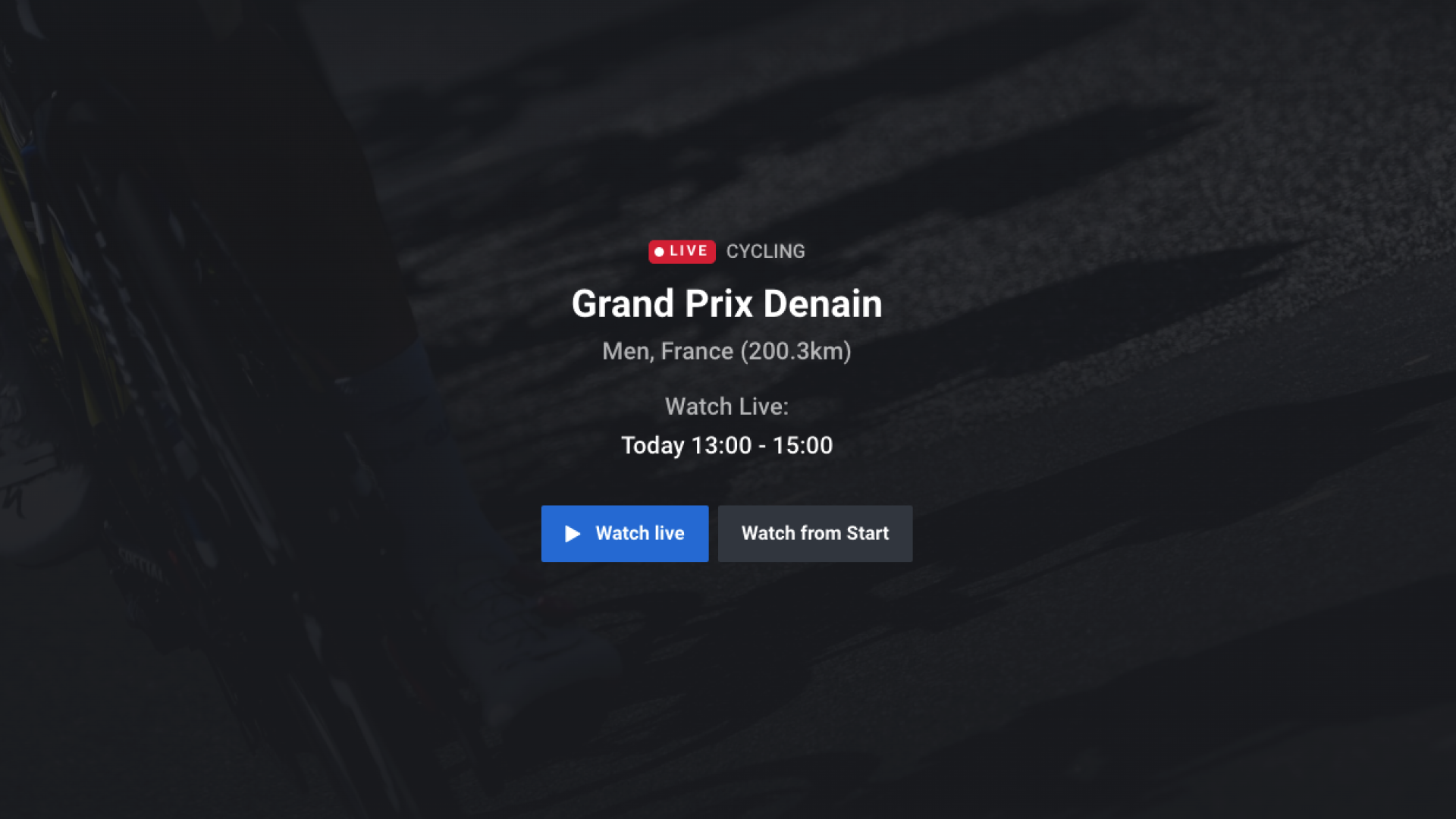
The production UI combines a high-impact content surface with a familiar time-based guide, helping viewers scan what is live, compare what comes next and act quickly.
Responsive schedule experience
Mobile and tablet layouts preserve the core navigation model while adjusting information density, imagery and programme detail for touch.
From schedule to playback
The experience carries the viewer's intent into the live event, including start-over choices and clear programme context.
UX performance
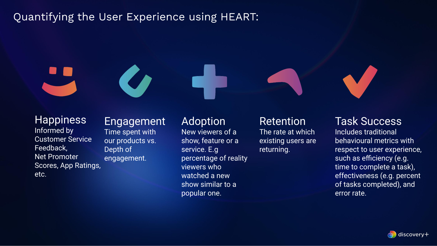
H.E.A.R.T. turned experience quality into a shared scorecard.
I worked with research to define how the team would measure the experience after launch. The framework connected qualitative feedback with behavioural data, feature adoption, return behaviour and task performance.
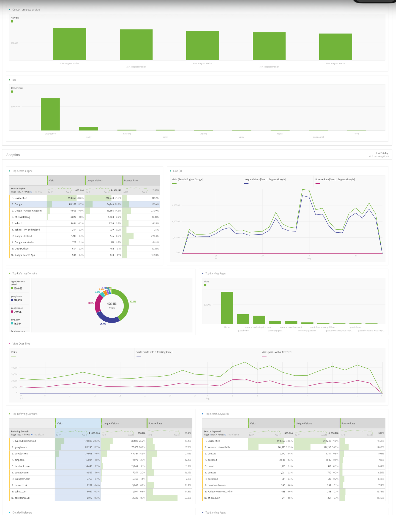
This gave product and design a common way to judge whether the EPG was becoming easier to use and more valuable to viewers. The supporting dashboard made adoption, engagement and content behaviour visible over time.
Customer feedback, ratings and reported satisfaction.
Time spent and depth of interaction with the guide.
Use of the redesigned EPG and its new features.
Whether existing viewers returned to the experience.
Efficiency, completion, effectiveness and error rates.
Post-launch impact
Every H.E.A.R.T. measure improved after launch.
The redesigned EPG made live content more visual, interactive and easier to browse. Post-launch measurement showed gains across satisfaction, engagement, feature adoption, retention and usability.
The result demonstrates the value of linking design leadership and craft to a measurement plan from the start.
Improvement reflected in qualitative customer feedback.
Supported by a more visual and interactive EPG experience.
More viewers used the new EPG capabilities.
Better content discovery supported stronger return behaviour.
Improved usability helped viewers complete key tasks.
Post-launch changes measured through the project's H.E.A.R.T. performance framework.
 UX Manager • Cross platform • Streaming
Project Overview
Discovery networks had quite a large selection of programs available to watch via various brands and affiliates in Europe. In an effort to converge and unify the service it was decided that discovery+ should be more consistent across countries and platforms.Based on a feature specific gap analysis and market research findings between discovery+ websites and apps from several countries; one of the features flagged to keep in the unified approach was the TV-Guide (also known as EPG) section.
Task
Design an EPG module to be built in discovery+ International (new component). This must be consistent with all platforms and based on up to date usability and accessibility standards
Role
UX Manager
Platform
Cross Platform
Brand
discovery+
Year
2019
UX Design Process
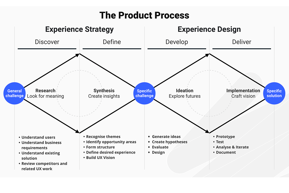
The “Double Diamond” describes the UX Design process I followed for this case. It can take hours, days, weeks or months for each step of the process depending on the scale of the project. In this case it took a 2 week sprint
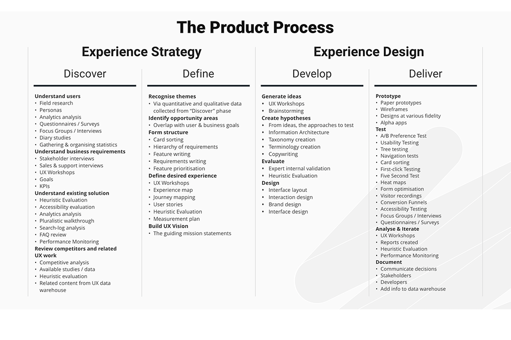
Daily UXD Actions 2 Week Sprint
- Contact with Product stakeholders to flesh out action plan Go through the project brief and business requirements
- Discuss and flag UX quick response caveats , dependencies and approach breakdown
- Helping with plan to allocate more UX and product design resources in a short notice and shift work-streams priorities and load
- Contact with user research team to assess level of ready to use data for insights
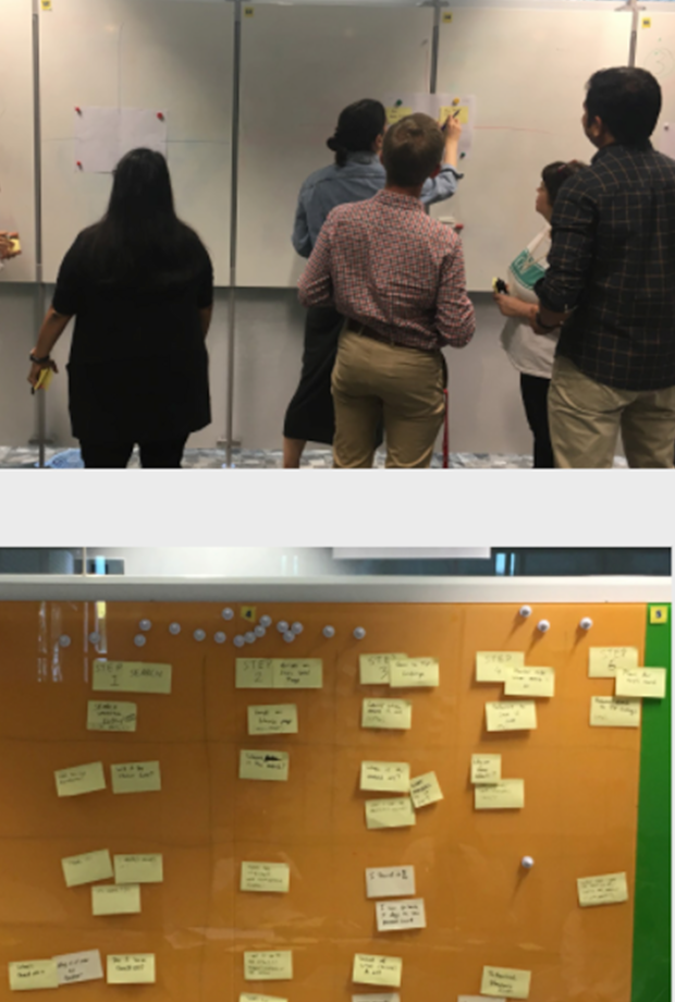
- Allocated war-room space to support lean UX collaboration
- Comms with product owner and project manager for next steps and action plans

- Led UX planning session with 3X senior UX, Lead product Designer, 1X Lead researcher to help with responding to the brief requirements.
- Planning included UX discovery and research efforts based on platforms (competitor analysis and best practices around TV guide requirements based on the project brief)
- Led team work to define basic assessment criteria for analysis to be used as common ground for reporting
- Agreed priorities and next steps for delivering findings (as top priority)
- Planed 2 week update sessions with UX, product, developers and design

- Reviewing user research insights provided by research team
- Conducting competitor analysis for web, leading efforts with 2 senior UX designers helping out with CTV and app fronts.
- Conducting best practices research on established and credible sources (NN group, Samsung, LG, Apple guidelines etc.) cross platform.
- Gathering and documenting draft insights and scalable approach on UX confluence space.

- Helped and organised team focus efforts and documentation to dedicated confluence space
- Producing draft user journey and flow diagrams to help visualise findings and conversation with product team stakeholders
- Initial UX approach sync up with UX team around : documented requirements user insights and best practices per platform.
- Catchup with Lead front end developer for update on rough feasibility guidelines Initial flows and system exploration
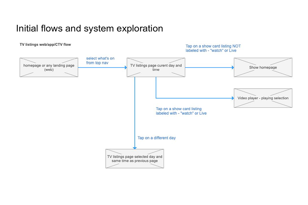
- Facilitated and led a workshop with UX team, product owners and developers to present findings and potential design approaches based on accumulated findings and insights from the discovery phase.
- Refined and helped prioritise business requirements and converged on initial UX approach based on team consensus

- Produced UX deliverables for responsive web and CTV based on updated requirements from the previous phase.
- Defined draft UX acceptance criteria based on agreed approach
- Produced axure wireframes and flows accordingly
- Produced draft axure prototype to help visualise proposed approach
- Managed 2 senior UX designers to help and align with mobile app approach and documentation
- Updated UX confluence documentation and comms on efforts with product owner and project manager for next steps and action plans
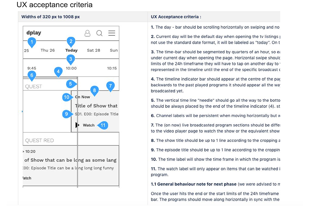
- Catchup with UX team, product owners and developers to present UX documentation and proposed approach based on set priorities and requirements.
- Catchup with product design and alignment with the Design system
- Produced axure wireframes and flows accordingly
- Catch Up and update with the research team to define UX/UI performance measurement requirements according to H.E.A.R.T framework and plan next steps for feature specific user feedback
- Catchup and criteria
- Updated UX confluence documentation and comms on efforts with product owner and project manager for next steps and action plans


More case studies
Explore related work.
Selected examples across enterprise platforms, streaming experiences, UX strategy and digital transformation.